Poster Comments


Above is my poster nearing the end. I lowered the saturation on the background image meaning the text stands out more. I moved Robbie further left, and had the two actors facing away from each other to emphasise the divide in opinion as seen in our trailer. As for the title, I used flares on the left side of each letter, making it stand out more from the other text and the background. Behind I used a black brush to blend the background images into black, so that the text sat nicely against it. The trickiest part was finding the correct fonts for the text. I found a billing block font online, but it was deciding the font for the actors names which was the hardest. In the end I want for a sleek middle thickness font which allowed for slight contrast to the title and catch phrase.  I used red and grey as colours so that the red stands out while the grey is still readable. I found that the use of white in a poster can sometimes look messy, as it is too perfect, where instead I preferred to use off white as seen in the text and the background to the left of Robbie. Another problem I faced was the large gap in the centre of the poster. I tried filling it with images of the female character, but the image just didn't blend well together. All in all I am pleased with how the poster looks at the moment, but there are just a few more finishing touches to add. 

EL

Poster Textures and Images

For the background skyline I used this image as seen below. I liked the blue sky and pale buildings with the bullet shaped building in the distant background. I overlaid this image with the image of Charlie on the ledge, cropping our all the negative space so that one image sat on top of the other image seamlessly. 


Below shows some grungy textures which I experimented with. I played around with overlaying it on images and text to create a more urban and grungy feel to the overall poster. I used 'screen' setting, whilst lowering the brightness and increasing the exposure to create a darker texture with no background. This is the same texture used over our reviews in our trailer, so I was keen to use this in my poster. 


The ink was very hard to shoot, with all sorts of reflections from the container and the slow speeds of the moving ink. We tried both red and black, giving the sense of blood and movement. I wanted to use this in my poster, as it played a major role in our trailer as it was the background for our title. Because of such, and as also seen in the mock poster, I wanted to overlay this with the text, so I created a clipping mask, meaning it overlaid the text without any excess colour. I used the red, as I felt it stood out nicely against the black, and I fiddled with the settings, lowering the contrast and putting a darker red hue over the top. This meant it felt more like blood and was much bolder in comparison to before. 


EL

Poster Images

After creating the mock poster, I became aware of the background shot I wanted to use, that being a skyline shot of London and with Charlie in the foreground stood on a ledge. I took this shot on our school premises, on the roof of the science block which had an overlooking, but distant view, of London. Below are some examples of the shots I took.


Where before in the mock poster I had Charlie facing in the other direction, I thought I would have him facing away from Robbie, as to create the tension and divide between the two characters like we see in the trailer. After taking the shots, I realised the background was too far away and the sky too dark to create a stand out poster. This lead me to rethinking the idea behind the background, and after speaking to my teacher I decided it was best to use a photo from the internet, as every other photo was my own, meaning it would not effect my mark.

EL

Poster Idea 2

After analysing real media texts I began creating a mock poster for the real thing. I particularly like the Alex Cross poster, and wanted to achieve that urban feel. I used photoshop to create this first mock, and I used screenshots form the trailer as images for the poster, meaning they were not great quality, but it gave the poster an overall feel for what i wanted it to do. I used images of Charlie and Robbie, and cropped them out of the background. I created a double exposure, where Robbie fades into the image of  charlie on the ledge in the background. The background image itself was comprised out of a skyline image and an image of a ledge, putting the two together to make it look like Charlie is in front of the London skyline. I played around with colour and saturation, deciding that the black and white worked best, but I may change this later. A key feature throughout our trailer was the idea of ink running across the page, to an extent meaning to resemble blood. I wanted to capture this within my poster, and so tried two different methods of including the ink, one being it laid over the text, and the other having the colour run off the page into ink as seen as the bottom. My favourite is the ink over the text, which I will keep, as well as play with to get a darker red, more linked to the blood in our trailer.


EL

Poster Idea


I particularly liked the Identity film poster, where it had this sort of style, as the actors made up the fingers for the hand. I layered screenshots of the actors for the fingers and ink for the palm, but I lose some of the detail in the characters and the detail of the ink. I like this idea, but it would require a lot of work. The use of the let most finger being white is to show the divide between him and the other two male robbers, as he is perceived as the 'good guy' in our trailer. The red and black has a grungy effect as though it is blood, setting up the thriller genre for our trailer. other than that I believe I prefer the other poster style, and can achieve a lot more than using this idea. 

EL

Magazine Cover Ideas


 For my magazine cover ideas I was particularly indecisive with the exact feel and style of the poster. I wanted to create a 'Little White Lies' type of magazine cover, with the slick and minimalist feel, however I was concerned I would not be able to include enough features to achieve a high mark. As such I began my ideas based around a 'Sight and Sound' type cover, using a strong base image with text over the top. I used a series of screen shots of our actors to create the mock up, but after doing so I was aware that I wanted and was set on doing a more stylised cover such as 'Little White Lies'.


I decided to have a go at mocking up a cover with the same style of a strong image, but add texture and style to the image, as well as bring in a background image as to create a more minimalist yet sophisticated feel to my cover. I used a series of Photoshop filters, as well as screen shots from our trailer layered on top of each other to create the slight 'outline glow' on the graffiti, as well as Robbie himself. However, after looking in closer depth at 'Little White Lies' cover's, they were far more stylised and graphically strong than this. 


I wanted to create a poster like effect, playing around with filters such as 'cut out', and 'posterise', where It created this 2D feel to both the background and the image of Robbie. The only problem with such is that the detail of Robbie is lost, as well as the background, and so I changed this by filling in sections of both the background and foreground different colours. This created an overall more tonal effect which I liked. 


I pushed this idea further, using a very similar style as to the one before, but taking inspiration from the 'Little White Lies' cover of Drive, where Ryan Gosling was in the foreground, and the background consisted of layers of coloured skyline which faded into white. Instead I tried using light pink to lift the cover, but I was not keen on this. As for the title, I liked the idea of it replication a puff, and the title idea was based around the circular and lens shape of the puff. 

I will do a photo shoot as to find the right image for my cover, and I will develop this last idea further. I want to play around with colour, text placement, and style which will be seen in later posts as my cover develops. 

EL


Magazine cover analysis - Inherent Vice


One of the key themes within Little White Lies magazine covers is the use of a strong central image created in a style of an illustration. The colours generally carry connotations of the style and tone seen within the film, here the orange and yellow creating a sense of the colours used within the film. A mother defining factor is the use of very little or no text, often only the title of the film is seen, allowing for a minimalistic them and style which follows the overall artistic feel of the cover. The title being in a recreation of a puff style works really well, allowing for the strong central image to be the main focus, while all other text and details needed are viewable but not complicatedly distracting away from the image. The floral image with the outline image over the top works really well, being clear well still artistic and abstract. Another common feature in the way in which the magazine world is through the use of the illustration itself, where commonly the magazine will employ someone to create an illustration for the cover, which is something I may do myself, possibly drawing it on paper and then developing this on the computer suing Adobe illustrator as well as Adobe Photoshop. In terms of how other Little White Lies covers compare, this is definitely one of my personal favourites, as the colour, mixed with the black as well as the contrasting white for the title draws the viewers eye on and works around the page. There is little detail, but is just enough, and slightly abstract to keep the cover interesting and attention grabbing.     

EL

Magazine Cover - Analysis


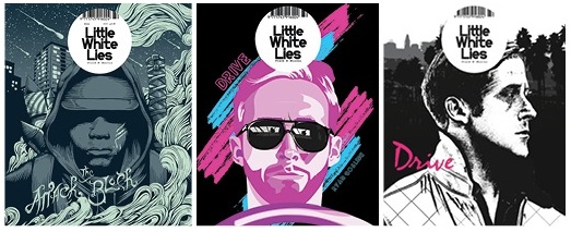
For my magazine, I have been largely interested in the more arty, minimalist style such as Little White Lies or Sight and Sound, with the simple titles and clean layout of text. I particularly like the Little White Lies covers, which employ simplistic style through the illustration on the cover, and minimal text to create the overall minimalist style. The commonly employ an illustrator to create the covers, which is a concept I really like. The title itself sits in an variation of a Puff, with the white standing off the background making the title clear. The only text commonly viewable on the cover is the title of the featured movie, as seen above to be Attack the Block, and Drive. My favourite cover out of all three is the far right drive cover, and is something I will work closely with. The Sight and Sound magazines are not my favourite, however they employ a great technique allowing the text to sit on the page without being to distracting. The main central images are clear, and idea I might use in my cover, however I am thinking about merging the two styles to create an illustrated cover like Little White Lies, and laying minimalist, non varied colour text over the top in the style of Sight and Sound. In particular I like the Shame cover, where the text is all right alined and uses bold fonts and non bold fonts to create a form of sub headings and main text. This is something I want to use within my own cover. Noticeable things about all covers are that the title of the magazine is commonly at the top, a trope my magazine will conform to. As well as this, the title of the film the cover shows is at the bottom, something I will also follow. The text is commonly placed around the central image and rarely over it, which is again something I will do. As for the main image, the Little White Lies covers normally use colour and vary in colour, which is something I will use to help my cover stand out.

EL