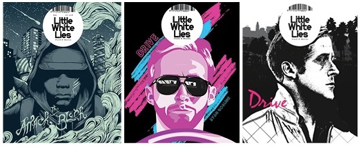

For my magazine, I have been largely interested in the more arty, minimalist style such as Little White Lies or Sight and Sound, with the simple titles and clean layout of text. I particularly like the Little White Lies covers, which employ simplistic style through the illustration on the cover, and minimal text to create the overall minimalist style. The commonly employ an illustrator to create the covers, which is a concept I really like. The title itself sits in an variation of a Puff, with the white standing off the background making the title clear. The only text commonly viewable on the cover is the title of the featured movie, as seen above to be Attack the Block, and Drive. My favourite cover out of all three is the far right drive cover, and is something I will work closely with. The Sight and Sound magazines are not my favourite, however they employ a great technique allowing the text to sit on the page without being to distracting. The main central images are clear, and idea I might use in my cover, however I am thinking about merging the two styles to create an illustrated cover like Little White Lies, and laying minimalist, non varied colour text over the top in the style of Sight and Sound. In particular I like the Shame cover, where the text is all right alined and uses bold fonts and non bold fonts to create a form of sub headings and main text. This is something I want to use within my own cover. Noticeable things about all covers are that the title of the magazine is commonly at the top, a trope my magazine will conform to. As well as this, the title of the film the cover shows is at the bottom, something I will also follow. The text is commonly placed around the central image and rarely over it, which is again something I will do. As for the main image, the Little White Lies covers normally use colour and vary in colour, which is something I will use to help my cover stand out.
EL


